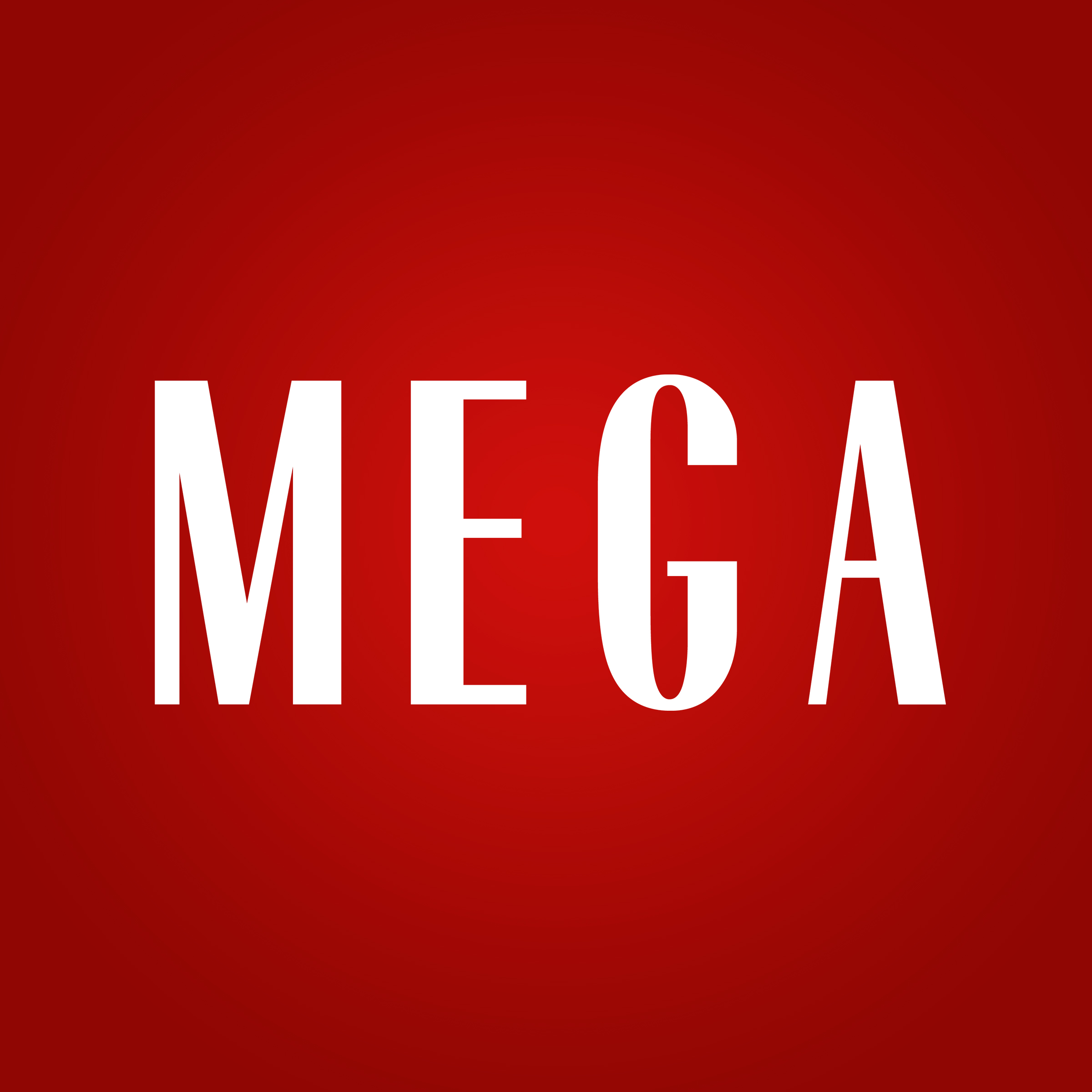
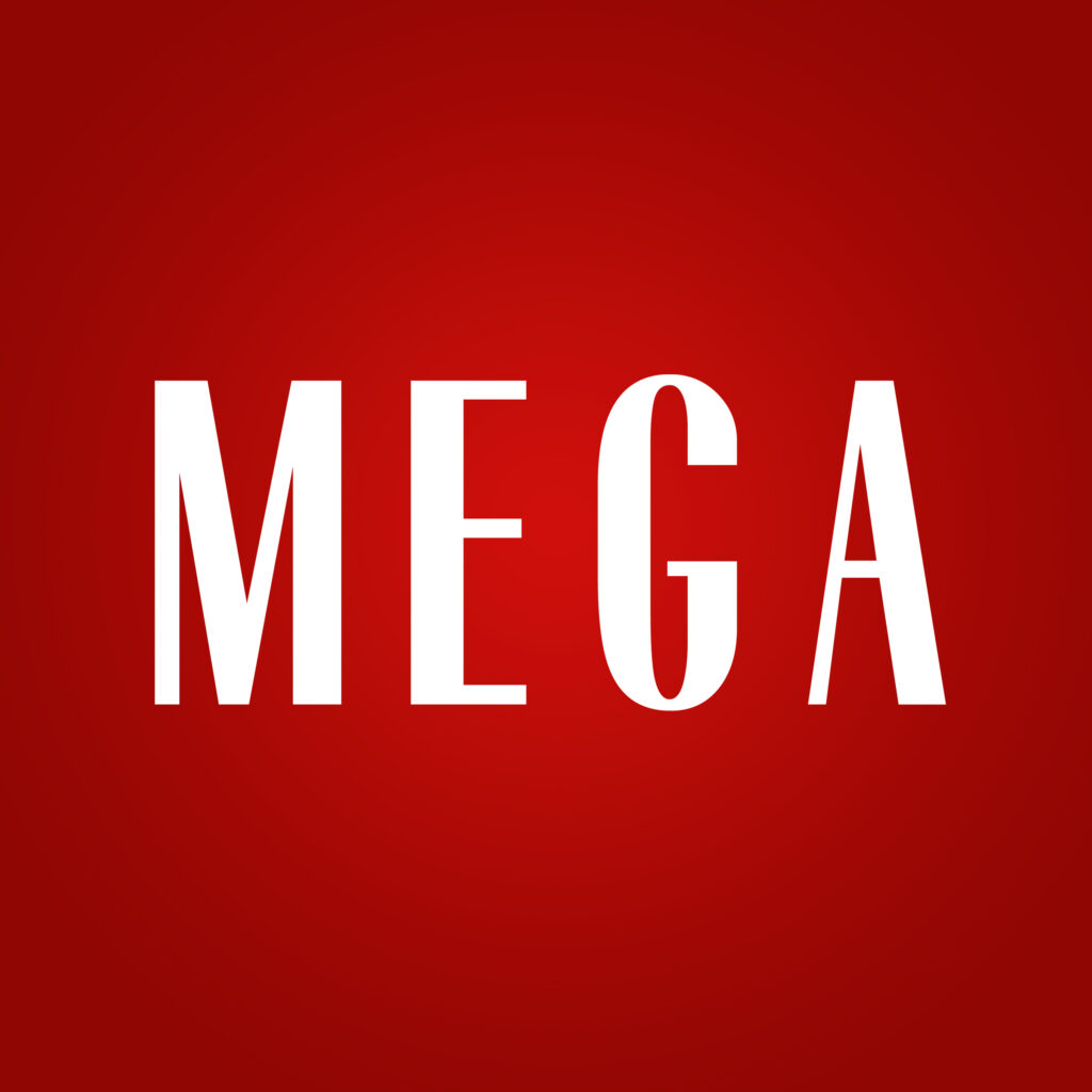
Look to the future as MEGA takes a bold and brave leap forward with a bolder redesign of its logo—combining classic beauty and contemporary cool.
Your brand is not just a name—it’s a statement, a symbol people recognize and associate with your values. Logos are more than just visual signatures as they’re the heartbeats of a brand, a vital lifeline that connects with its audience, one that revels and reels for a new generation. This all-new masthead draws inspiration from the luxury of classic couture houses, where the design exudes sleekness, boldness, and lasting impact. Welcome to the new MEGA.
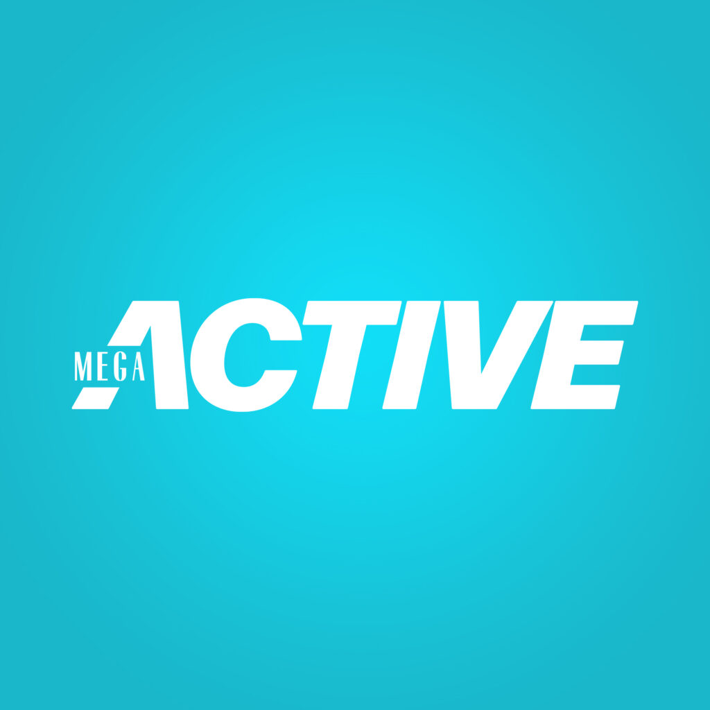
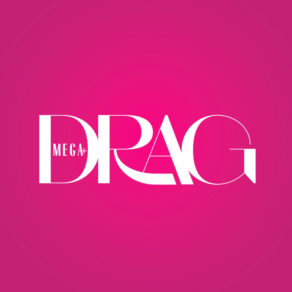
What sets this logo apart is its remarkable ability to convey the individuality inherent in the magazine’s sub-brands, namely MEGA Man, MEGA Entertainment, MEGA Style, MEGA Active, and MEGA Drag. Each letter within the logo asserts its independence, serving as a symbolic embodiment of the distinctive nature characterizing the brand’s diverse offerings. This deliberate autonomy accentuates and underlines the unparalleled uniqueness that defies expectations yet defines MEGA.
Independent synergy

However, when these letters come together, a synergy occurs: they form a formidable representation of unity and strength. The combination of these letters creates a powerful ensemble, becoming a composition that speaks to the collective strength arising from the diversity within the magazine. It harmonizes its varied sub-brands into a cohesive whole, thus reflecting the robust and multifaceted nature that defines the brand’s identity in its entirety.

“Our founder Sari Yap was always adamant about MEGA being the next big thing, whether it was discovering and nurturing new talent, being on the latest media platform, or catching the trends just bubbling up. In the ’90s, when she launched the title, her mission was to teach Filipinos how to dress up,” Editor-in-Chief Peewee Reyes-Isidro says of the evolved nature of the magazine. “Over the years, this has changed, and now, MEGA wants to show Filipinos how to express themselves, confidently and creatively, through fashion.”
Isidro shares the importance of embarking on an exciting era, a proposition that kickstarts a new direction—starting with a change of logo.
“A bigger, bolder font that delivers an obvious message: MEGA is here to stay, and it will be bigger, grander, and more fantastical.”
MEGA Editor-in-Chief Peewee Reyes-Isidro
Diverse hues
The significance of colors in shaping a brand’s emotional resonance cannot be overstated. The brand, with precision, leverages a rich and varied color palette, drawing inspiration from classic fashion and grounded in the artistic heritage of the Philippines.
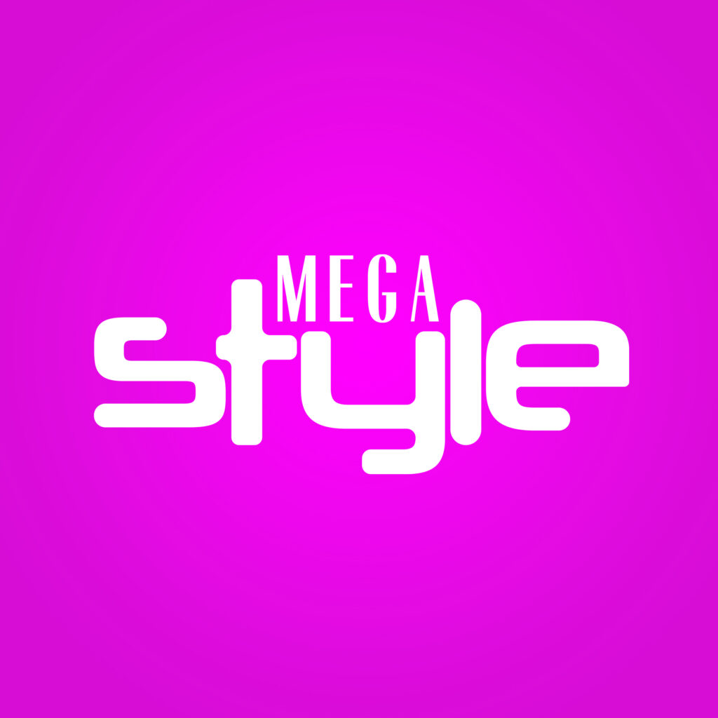
Rooted in the brand’s heritage, the primary colors—Ruby Red, Rich Black, and Muted Gold—pay homage to its illustrious past. Meanwhile, MEGA Style, MEGA Drag, and MEGA Man imbue a vibrant aura with Sunkist, Vivid Sky Blue, and French Violet. On the other hand, MEGA Entertainment and MEGA Active evoke a softer sentiment with shades like Eggshell, Carolina Blue, and Pastel Red, channeling pastel hues.
Revitalized and reinvigorated
The redesigned logo embodies art deco, exuding elegance and sophistication that bears tribute to a bygone era renowned for its exceptional style. It gazes at the beauty of history from an external perspective, recognizing that our past molds our present and shapes our aspirations for the future.
This logo transformation goes beyond surface-level aesthetics, serving as a profound reflection of the magazine’s evolutionary journey. It effectively connects nostalgia with forward-thinking optimism; Like selecting a little black dress, the process gathers an intentional choice reflecting a deep appreciation for enduring value, a symbol of eternal style.
Moving to the future
The new logo signifies a dedication to remaining pertinent, opulent, and true to its origins. It represents a brand unhesitant to acknowledge its history, revel in its present, and stride assertively toward a compelling future.
The magazine’s evolution transcends superficial aesthetics; it serves as an articulate expression and a pledge. As the brand consistently sets new benchmarks in fashion, beauty, and lifestyle, its updated logo becomes a symbol of a brand cognizant of its roots and primed for its forthcoming trajectory. This is the new MEGA, evolved yet timeless.
Head on over to https://mega-onemega.com/ to learn more about the new MEGAverse.