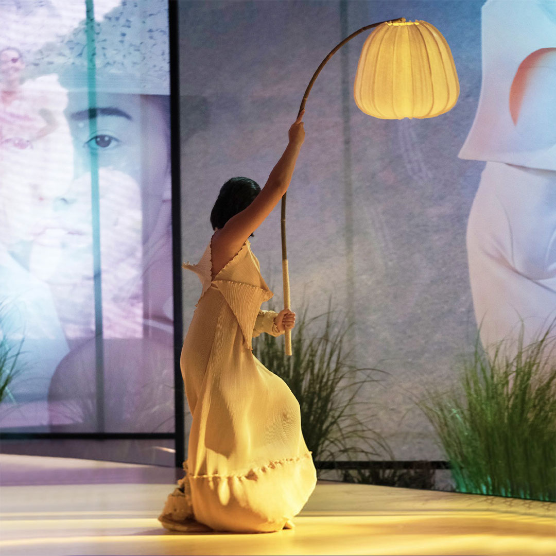
Scenographer Gino Gonzales brought the magazine to life.
It all started with a pathway. “Bea [Valdes, Vogue Philippines’ Editor-in-Chief] and I really wanted the idea of having a pathway that will lead the guests into a world,” scenographer and costume designer Gino Gonzales tells us. He was tasked with the tall order of mounting an exhibit at the Vogue Philippines Gala, on August 29, that ended with the cover reveal. After numerous iterations of the concept, it was this idea of a walkway that remained constant—and it marked the beginning of a journey that the evening’s guests embarked on.
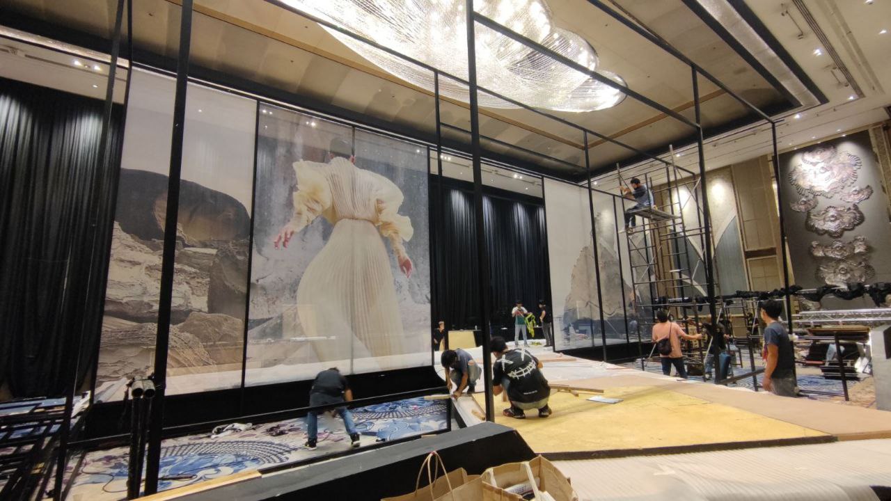
One maiden issue; Over 400 pages; Featuring three major island groups, multiple editorials, and countless stories about the Filipino. This was the breadth of material Gonzales worked with, and he and Valdes whittled the content down to bring the already stacked reading material to life. So Gonzales drew from his theater background to create an immersive three-minute experience.
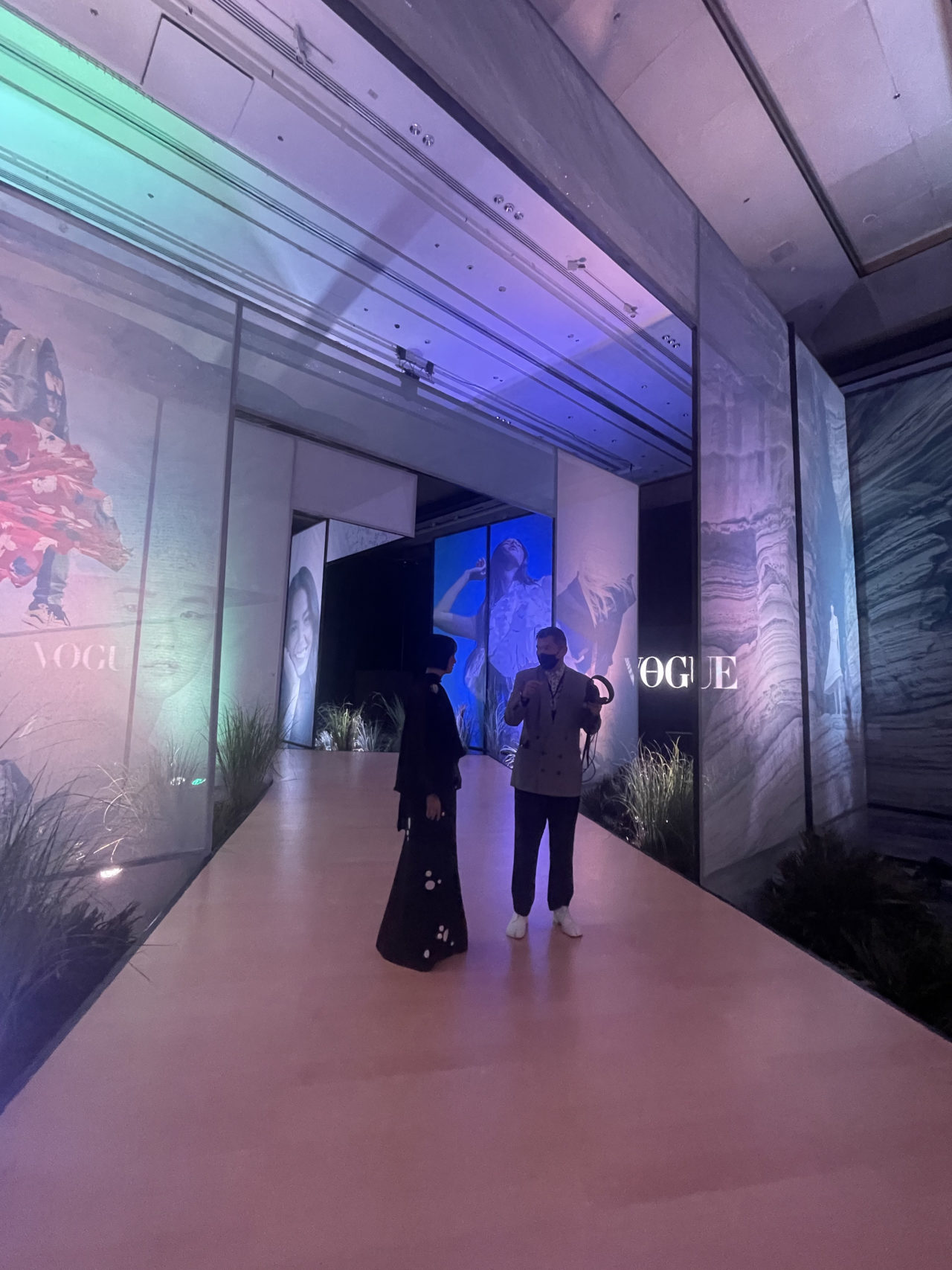
He built a series of nearly-translucent portals. The traditional theater device typically used to create depth is akin to a series of decreasing-in-size backdrops framing the stage. For the Vogue Philippines cover reveal, he upended the order and began with narrow portals that widened until the end of the pathway, where the cover, featuring the inimitable Chloe Magno, was revealed. His idea? “To take all of these guests literally through the pages of the magazine.”
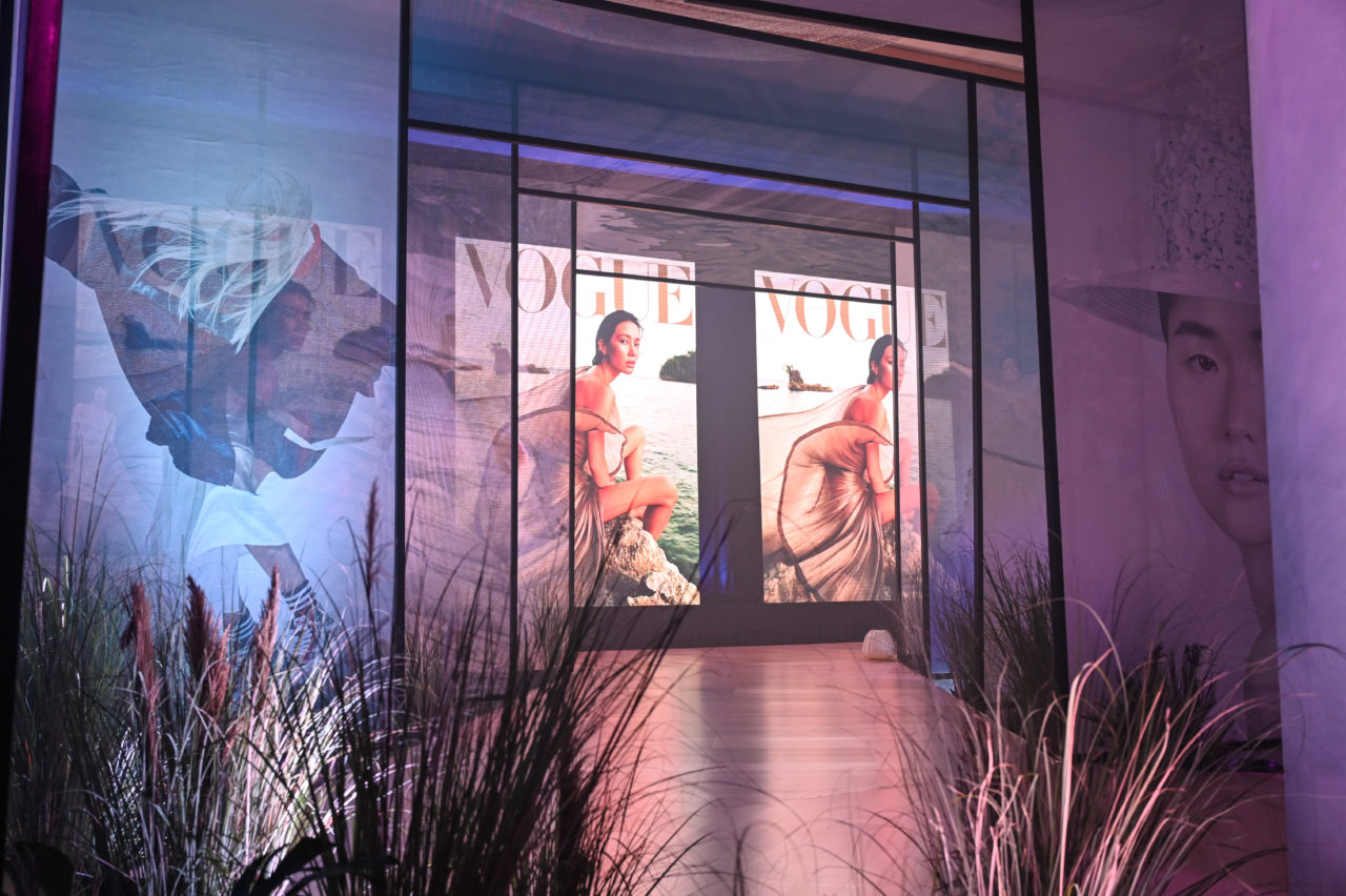
And that he did. In the Grand Ballroom of Shangri-La The Fort, Gonzales transformed an area into a “black box,” another theater practice, and blew up photographs from the magazine’s editorials printed on floor-to-almost-ceiling mesh tarps. Guests traversed the pathway placed in the center of these angled panels that mimicked the magazine’s spine. “It’s like the spread of a magazine,” he adds.
Walking through the path, made from engineered wood donated by Matimco, guests encountered large installations of photographs lifted from the Maiden Issue. Model Kelsey Merritt stunned in pink body shimmer from the “Greener With Pink” editorial; Siobhan Moylan looked futuristic in Toping Zamora’s terno from “The Shape of Now”; A model proudly wore a Bayo ensemble made from Bakong, a fiber indigenous to the country, from the feature “Future Fiber.”
Gonzales shares that he and Valdes wanted a better representative of “what the magazine encompasses” and veered from their initial plan of only showcasing the cover. “We experimented with the introduction of selected pages from all of the editorials, which I think worked,” he says.
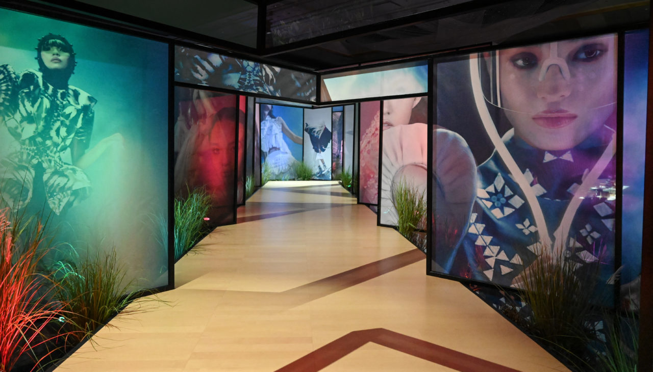
The exhibit also posed a challenge: foreign guests needed to leave with a sense of what the country is about, even in the confines of a hotel ballroom. So Gonzales drew on even more of the magazine’s elements, especially its cover. “[The cover] felt natural. It was showing clothing in a natural environment,” he recalls, saying it left a “big impression.” So he brought “the country inside” via a visceral, sensory experience that Gonzales fondly calls “a walk through nature.”
Arrangements of dried and fresh flora lined the pathways, many of them common plants found in the region. Anahaw, cogon, and ylang-ylang, among others, littered the carefully-organized floral clusters by Nikki Chatto, handpicked from King Louis Flowers and Plants. Some of these were even referenced in the magazine’s stories. “It’s the first issue coming to life,” Gonzales muses.
While going through the exhibit itself was an experience, the events leading up to it were also part of the grand reveal. The three-course dinner prepared by Chef Margarita Fores and Shangri-La’s Chef Carlo Huertes reimagined local dishes and was served on heirloom piña linens and cloths. After the meal, Valdes invited guests to the back room for the cover and the mise-en-scène, another theater device, began. Gonzales commissioned a group of “movers” to dance with paper lanterns from Wataru (the same paper the stage’s walls were built with) to usher guests through the exhibit. They wore outfits by Filipino designer Rajo Laurel, whose dress also made it to the cover.
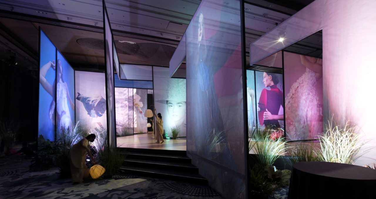
The challenge didn’t end in mounting the exhibit though. With the magazine’s ethos of sustainability, Gonzales also made sure the materials used at the event would be reused or recycled. The wooden floors will go to an office, he says, the metal frames that propped up the mesh will be melted and recycled, and the mesh will eventually be donated to a chosen foundation to be recycled as bags.
Despite the pressure of mounting the exhibit, Gonzales says it was a project he couldn’t say no to. “When I’m called for projects like these, it’s not just a design project, it’s also a patriotic duty,” he shares, adding that he, too, felt a stake in showcasing Filipino creativity. “In a way, we need to put our best foot forward as a country. We want to show the best of what we can offer in terms of creativity. It doesn’t always have to be something big. It can be something quiet and elegant.”
Head on over to vogue.ph for more news and updates about Vogue Philippines.